
Grade Level: Secondary (7-12) | VariQuest Tools: Perfecta 2400 | Academic Subject: Social Studies and History | Featured Topics: Lessons and Activities
As part of African American History Month, have students use current statistics on African Americans in the United States to create a visual display of the data and analyze the trends.
Prior to launching this lesson, stage a discussion with students about race in the United States. Key questions to ask may include:
-
What does the history of African American people in the United States look like?
-
Do we still discriminate against people of other races?
-
Have you had personal experiences with racism?
You may choose to use an article, such as Boiling Pot, A Scalding Lesson on America’s Enduring Racism, by Wardah Khalid to spark the discussion. (This article can be found here: http://www.huffingtonpost.com/wardah-khalid/boiling-pot-a-scalding-le_b_3381920.html.)
Explain to students that they will be researching an aspect of life for African Americans in the contemporary United States. Topics may include Population, Education, Families and Children, Income, Poverty, Health Insurance, Incarceration, etc…
Divide students into groups of 3-4 and assign each group a topic. Provide students access to research current statistics regarding the African American population in the United States. Here are a few websites to help students focus their research:
-
http://www.census.gov/newsroom/releases/archives/facts_for_features_special_editions/cb14-ff03.html
-
http://www.infoplease.com/black-history-month/facts-issues.html
If possible, have students gather current data (2014), as well as data from previous years, such as 2005, 1990, 1975, 1964 and 1955. After students have gathered enough information to notice a trend in the data, have them create an infographic.
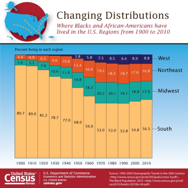
Note: there are several free and low-cost infographic design websites that offer easy-to-use instructions for novice designers. This site provides a few options: http://readwrite.com/2013/06/10/5-tools-for-creating-your-own-infographics#awesm=~otpmQFJNYmewJH. I would recommend http://infogr.am because of the ability to download the infographic as a .pdf, which will allow for seamless printing to the Perfecta.
Print out each infographic as a poster using the Perfecta. Display the posters around the room and have students complete a gallery walk. As students explore the infographics for each topic have them look specifically for trends in the data. Each student should answer the following questions:
-
What trends do you notice?
-
What conclusions can you draw based on the trends of the data?
Have students use this information to wrap up with a discussion about whether race-based discrimination still exists in the United States. As an assessment, students could write a paragraph answering the following question: Is race-based discrimination still an issue in the United States? Support your argument using information from three infographics.